Introduction
Every brand begins with a deep-seated need, want or a
fear. Through recognition of these the enterprise can create products that
alleviate the needs, wants and fears. These products (or services) should be codified
in corporate philosophy, particularly corporate purpose and the mission,
extending into vision, and delivered through values that prompt employees to act
in manners that exemplify the spirit of the product. On the basis of corporate
philosophy, the physical product and its promise, a brand identity system can
be formulated to communicate the identity and purpose of the product.
The brand identity system is adopted internally (to guide
decisions and corporate culture) and externally (to inform consumers of the
product’s ability to satisfy needs). Although both the internal and external
facets of the brand identity system have strong roots in the physical environment
and its experience, the brand identity system has a transformative effect on
its audiences by creating beliefs and emotions that its audiences associate
with and adopt as personal beliefs and attitudes that guide personal identity
and potentially group affiliation.
This is clearly visible in the Harley Davidson brand
identity system.
Harley Davidson core brand purpose and brand identity
system
The root of Harley Davidson’s brand identity system (Harley)
lies in uniformity, conformity, a perceived lack of freedom to make choices and
repetitious, unfulfilling personal lives. Harley’s purpose is to offer freedom,
and rebellion from the constraints of routines and workplaces. It stands for
rebel spirit in all of us, unity, individuality and personal freedom.
Do you march in line or step out of line?
How much freedom do you really have?
How much freedom do you really have?
Who Harley is, is the spirit of freedom and rebellion.
What Harley is, is an experience. Harley matters because its consumers are starved of
the experience of freedom and need to rebel.

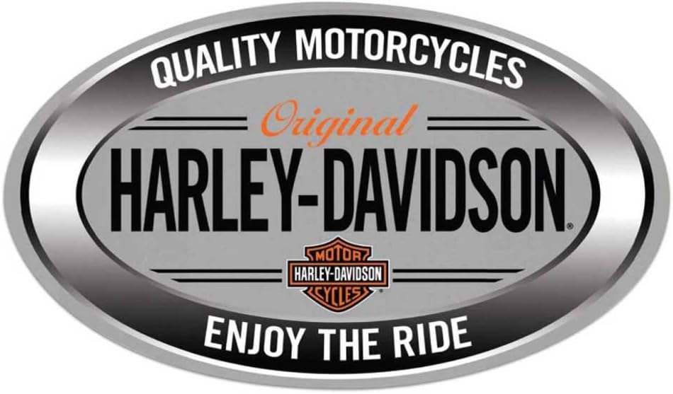
It’s brand mantra, although not clearly stated in planned
communication, is ‘Enjoy
the ride.’ This enables consumers to interpret the experience and rewards
that they can take from Harley by riding one of the bikes. It also establishes
the frame of reference for consumer dialogue with the brand, ‘enjoyment’.
Notably, this is consumer derived.
Internal expression of the brand identity system
Despite its mantra of the experience and enjoyment of
freedom, Harley is highly
governanced. Its vision is
expressed in strategy in product and
consumer measures. Its governance is also expressed in sustainability reporting which covers environmental
sustainability, social responsibility and governance. The internal values
that it expresses are integrity (model integrity), teamwork, creativity, accountability
and respect for individuality and diversity. The latter three give expression
to individualism and the potential benefit of rebellion against corporate
groupthink. (The internal language and visual identity is expressed in an
interactive video on the careers page where the values are stated.)
Components of the brand identity system
Through the combination of its personality (rebellious,
individualistic), mantra and tagline (Enjoy the ride), brand purpose (freedom
and rebellion from constraints), vision (new models and consumer growth),
positioning (enjoyment of freedom and rebellion) and internal values (above),
Harley creates an apparently effortless brand identity system for external
communication.
There are notable correlations in the brand identity
system, which indicate a high degree of focus. These mitigate against confusing
messages and a high degree of brand cohesion. The particular elements are
freedom and rebellion which echo in personality, purpose, positioning and in
the internal values.
External expression of the brand identity system
The components of the brand identity system are reflected
outwards through the visual and verbal language of the brand identity system.
These enable the consumer to recognise themselves in the brand, adopt it as an
element of individual identity and subsequently acquire the product and form
profitable loyalty.
Visual language
The heart of its visual language is the flight that is
required for freedom and rebellion, a breaking of constraints. This is embodied
in the wings that extend from its central logo.

Its central logo depicts martial strength in the form of
a shield, yet the shield is also a defensive device, so on a subconscious level
it is might also be interpreted as defence against attacks on freedom.
The Block Gothic lettering against black and orange
accents is bold and demanding. This type reappears in its advertising. The
custom orange font is martial and industrial in nature. Secondary Deftone type
on dealerships and in other applications reminds us of chrome lettering of the
50s, an era in which the beat generation popularized motorcycling as a path to
freedom.

The motorcycle is, however, probably its most
recognizable symbol, built low-slung, with a characteristic concave seat and
accented in dark or orange colours with noticeable chrome. Even without the
symbol, a motorcycle can easily be recognised as a Harley-Davidson.
The visual imagery that characterises Harley-Davidson is
speed, freedom and the open road, echoing a flight from the mundane, the
constricting urban landscape and the excitement of speed.
Although motorcycling is commonly associated with bearded
biker gangs, the brand now uses leather to obscure its primary middle-aged
market and is beginning to identify women and millennials.

Women and millennials have been
identified as future markets in which the brand can grow.

The brand also depicts togetherness on the open road and in its brand activation, the Harley Owners Group (HOG).
This is paradoxical as although the brand emphasizes individual
freedom, groups create safety in numbers and have their own requirements
for conformity.
Verbal language
It asserts its freedom by rebelling without a specific reason. However by rejecting US chauvinism it may gain traction in markets which are less enamoured of the USA.


The language, in short hashtag terms used on social media, also challenges stereotypes (see Soccer Mom above). This broadens the market.

Harley-Davidson also punts an association with the independence of its members. The ‘Harley Spirit’ campaign builds itself into the family by depicting infants and toddlers who will grow to become ideal members of the Harley-Davidson fraternity by virtue of their independence.
Product features and benefits are notably absent from the Harley-Davidson above-the-line material, which makes it a brand built on emotional connection with its users and their associations with the brand. This is a logical choice as the quality of the machinery and technology is tangible, experiential and its associations can be transferred through awareness and associations of other users.
Conclusion
Although Harley Davidson is a tangible product which is
in many ways substitutable with other motorcycles, its strength is rooted in
resonance which it achieves with a strong brand identity system that has a high
degree of cohesion, expressed in highly characteristic visual and verbal
language that enables consumers to adopt the brand as part of their own
identity systems.
Sources
UCT Brand Management Course Notes
Harley-Davidson Company
https://www.harley-davidson.com/us/en/about-us/company.html
Harley-Davidson Owner's Group
https://www.harley-davidson.com/us/en/owners/hog.html
Copyright
Harley-Davidson visuals © Harley-Davidson.
Metropolis clip © FW Murnau Foundation


No comments:
Post a Comment